
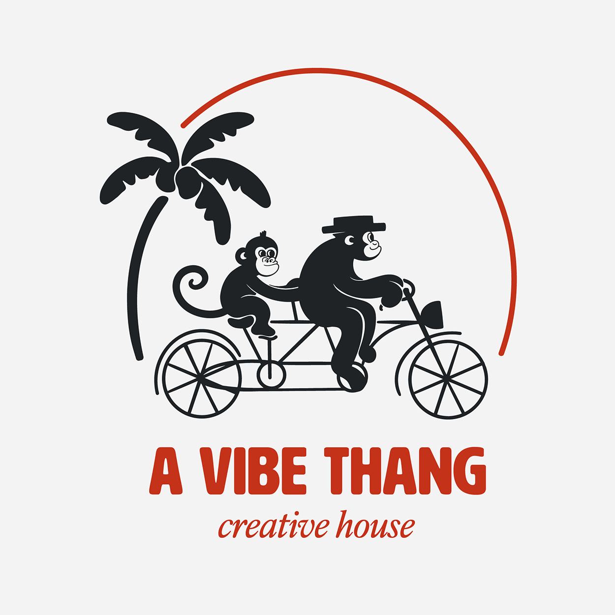
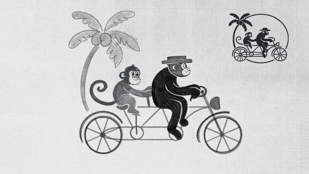
A Vibe Thang develops a visual world that ignores standard studio codes. The motif featuring monkeys, a tandem bike, and a palm tree provides the brand with a narrative core, making it instantly recognizable. This creates a brand presence that functions less through explanation and more through pure attitude.

The wordmark utilizes HWT Artz, a typeface by Erik Spiekermann based on early 20th-century European poster lettering. Its robust forms and rounded corners give the brand visual "pressure" without appearing stiff. This ensures the brand doesn't just use random display typography, but carries a tone with historical friction and a distinct presence.


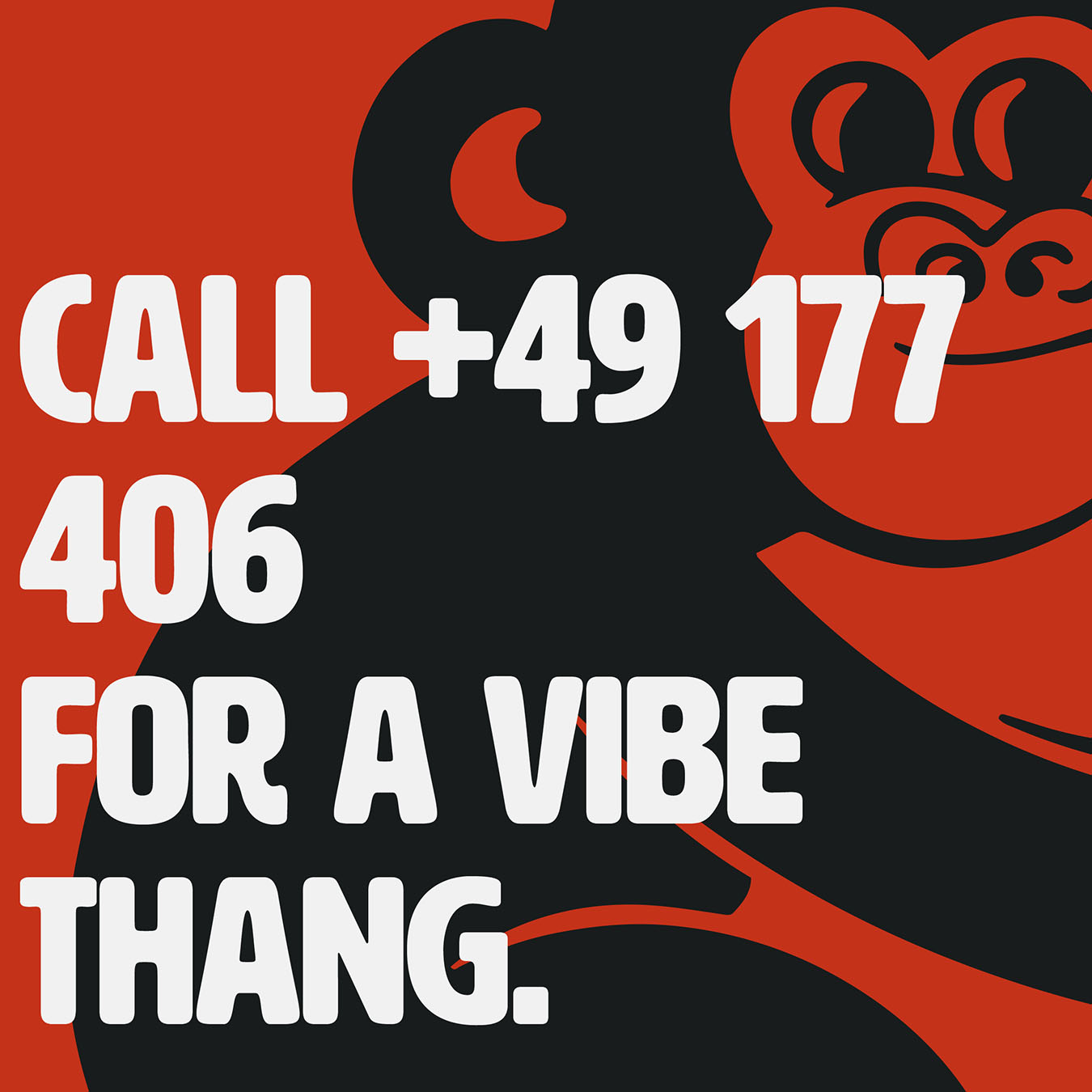
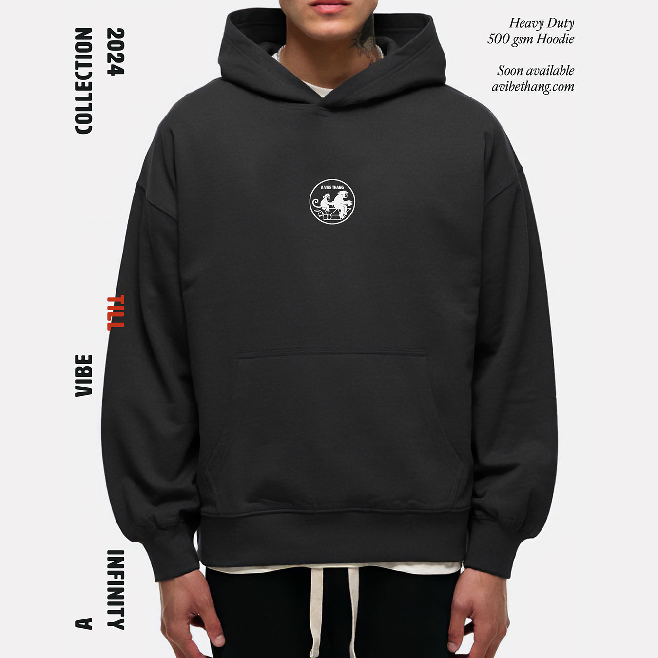

The identity carries across merchandise, cases, and digital applications without losing its character. Specifically, the combination of black surfaces, light typesetting, and dense red intensifies the bold, poster-like effect of the typography, making the brand authorship clear even from a distance. This ensures the brand doesn't feel like a decorated product, but like a cohesive cultural statement.